New Blank Document
by Matthew Offenbacher
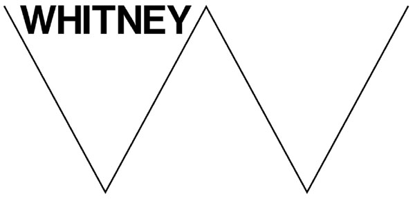
There is a kind of graphic design that is deliberately non-designy, uninflected, generic. You see it often in art contexts. The logo of the exhibition aggregator “Contemporary Art Daily” is a good example (Figure 1). Another is Experimental Jetset’s recent rebranding of the Whitney Museum (Figure 2). The designers Dexter Sinister pioneered this approach (www.dextersinister.org). You also sometimes see this style adopted by retail companies who want to associate themselves with contemporary art, such as American Apparel (Figure 3).
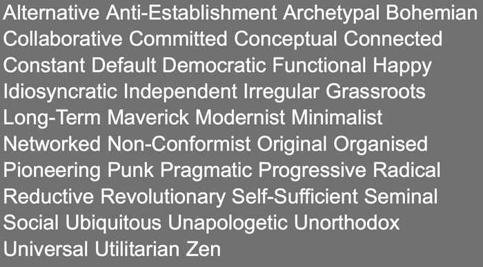
What these designs have in common is a mood I would call “institutional nonchalance”. Their blank affect is reminiscent of street signs or tax returns, communicating a kind of hegemonic power. At the same time, the apparent lack of effort in their production suggests a slacker’s anti-authoritarian “whatever”. I think the appeal of this style comes from this paradoxical combination of authority and anti-authority. When you visit the website of Indexhibit, the popular generic web portfolio software “for the creative community”, the first thing you see is an alphabetical list of words proudly offering up these contradictions: ubiquitous and idiosyncratic, utilitarian and revolutionary, pragmatic and punk (Figure 4).
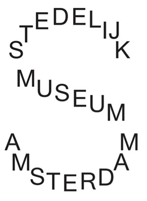
I just got back to Seattle from a three-month residency in Rotterdam. One interesting thing I learned is that this design approach probably originated in the mid-1990s in the Netherlands, at the Werkplaats Typografie in Arnhem. It continues to be a strong current in Dutch design. For example, there has been much debate in Amsterdam lately over Armand Mevis and Linda Van Deursen’s rebranding for the Stedelijk Museum (Figure 5). Disparaging commentary has most often been of the “my kid could have done that” variety. Mevis & Van Deursen are perhaps the most well-known practitioners of knowingly generic design. I think their Stedelijk work is particularly subtle and interesting. It strikes me as lovingly awkward—self-mocking even—in acknowledgement, perhaps, of its existential contradictions.
In a 2003 interview for Emigre magazine, Rob Giampietro named this approach “Default Systems Design”. He describes it as a methodical exploitation of the preordained settings found in common computer design tools. These settings are the “defaults” which a user must manually override in the process of creating a design. Default Systems Design chooses to retain any number of these settings, “offering a release from the breathless pace at which design now runs, as clients ask for more, quicker, now.” Giampietro continues:
“Defaults are the status quo.... To view a computer through its default settings is to view it as it’s been programmed to view itself, even to give it a kind of authority. Naturally, ‘a default’ is produced by systemic thinking ... and ‘defaults,’ taken cumulatively, could be defined as the system by which the machine operates when no one is actively operating it. The system makes assumptions that, unchallenged, become truths.”Using a plain or banal aesthetic to visualize a system “as it’s been programmed to view itself” should sound familiar. Marcel Duchamp invented this approach when he submitted Fountain to the 1917 exhibition of the Society of Independent Artists. Duchamp’s bid to have an unaltered industrial urinal accepted as sculpture shifted the site of production of meaning, from artists and the objects they make, to the contexts in which artists and objects are formed, exhibited, distributed, sold, and so on. The result, almost one hundred years later, is a kind of machine whose ideal condition is to “operate when no one is actually operating it”. It feeds its own assumptions back into itself in a self-perpetuating production of value. The sort of value produced, in terms of larger society, is analogous to the value of consumer debt: abstract, vulnerable to manipulation, reinforcing of the status quo, and organized with “default” as its base condition.
K-Hole, a somewhat fictional “trend forecasting group” created by New York artists Greg Fong, Sean Monahan, Emily Segal, Chris Sherron and Dena Yago, published a report last year applying the idea of Default Systems Design to fashion and personal identity. Youth Mode: A Report On Freedom introduced the term “normcore”, which, in a simplified form, quickly became an internet meme. It is worth quoting from their deliberately convoluted report:
“Sameness is not to be mistaken for minimalism. You gain a temporary mobility and a sense of being unencumbered by making fewer and more considered decisions. But going back to basics doesn’t work when the scripts that determine the basics are out of whack. Eventually, you end up stalling.... Normcore moves away from a coolness that relies on difference to a post-authenticity coolness that opts in to sameness. But instead of appropriating an aestheticized version of the mainstream, it just cops to the situation at hand. To be truly Normcore, you need to understand that there’s no such thing as normal.”Is this giving-in or standing-up? Complicity or resistance? You can become lost as you thread yourself through the machine. You think you are making something meaningful, using the machine to visualize “the systems by which the machine operates.” Suddenly, however, you find yourself in default, “viewing [the system] as it’s been programmed to view itself.” Before you know it, you have removed from your art the possibility of an ethical and political engagement with the world.
Despite all the playful doubling-back, it is hard to avoid the question: what is the default? How about: white, upper-middle class, male, CIS-gendered, straight, able-bodied, North American? In his recent book Normal Life, Dean Spade argues that norms, even when applied inconsistently and arbitrarily, support institutional violence and the unequal distribution of life chances. What is considered normal in race, bodies, health, gender, and reproduction “operates in the background and is presumed as ‘neutral’ features of various administrative systems.” Although the existence and operation of these norms are “less visible than those moments when people are fired or killed or excluded explicitly because of their race or body type or gender”, they have a greater potential to harm “because they structure the entire context of life.” It is perhaps not surprising that late in his Emigre conversation, Giampietro describes Default Systems Design as an expression of “sadness, loss and shame.”
 1. Contemporary Art Daily logo, 2008.
 2. Whitney Museum logo, Experimental Jetset, 2013. The “W” is intended to
dynamically respond to its surroundings, distorting so that it fills up available space.
 3. American Apparel logo, 1999.
 4. Indexhibit homepage, www.indexhibit.org,
Daniel Eatock and Jeffery Vaska.
 5. Stedelijk
Museum logo, Mevis & Van Deursen, 2012. The typeface is Union, designed by Radim
Peško in 2009. Union is a synthesis of Arial and Helvetica, “intended for
situations where Helvetica seems too sophisticated and Arial too vulgar, or
vice versa” (www.radimpesko.com).